X Bar and R Chart is one of the very popular type of quality control chart and also sub-part of 7 QC tools. It is also called mean and range chart. As per the name of X Bar and R chart, it clearly indicates the involvement of parameters mean and parameters range within the process. In this chart we will try to analyze quality co-ordinate statistically and predict process within control or not. In short mean & range chart provide the information related to process stability checking, parameters deviations from mean and range of various samples and trends of data points.
In the usage of X bar and R chart more samples you collect from various products, it will very helpful to check overall process variability. If data samples are less X-bar and range chart not the provide more accurate results. There are also other quality tools that help to analyze quality of product or process very effectively such as Pareto Analysis, Histogram and many more.
Criteria of Use Mean and Range chart.
- Sample Size – 2 to 9
- Data in Variable Nature.
Sequential Steps to Make X Bar & R Chart: –
Step – 1: – Collect the relevant quality data and maintain the sample size range between 2 to 9 and copy the data into excel sheet.
Step – 2: – Calculate the mean and range of sample data based on excel formulas as per mention below.
[Mean = (Sum of all the sample value / Numbers of sample collected)]
[Range = (Max. value within sample – Min. value within sample)]
Step – 3: – Calculate the process mean and mean sample range using below formula in excel sheet.
[Process mean = (sum of all mean sample wise / total count of mean)]
[Mean sample range = (sum of total range sample wise / total count of range)]
Step – 4: – Calculate upper & lower control limit, and center line using below mention formula in excel sheet.

Step – 5: – Developed the data table for X bar and R chart graph in excel sheet. (This data table are more clarify in case study as per below mention)
Step – 6: – Select the appropriate data table as per earlier developed & go to insert & select recommend chart and select line chart option.
Step – 7: – Formatting the chart as per your requirement.
Case Study – 1 – X Bar and R Chart: –
A pen manufacturing organization produce the various products as per customer requirement. They are dealing with various customers but as of now due to increasing competitiveness in the market, customer want to improve product quality during manufacturing. So, pen manufacturing organization taking decision to monitor product quality statistically. Organization share some quality data points collected by quality departments as per mention below.
Quality control department collected data into 6 samples and the same exercise repeat the 25 times in-short subgroup size is 25. So, organization want to analyze this quality data points with X bar and R Chart or mean and range chart.
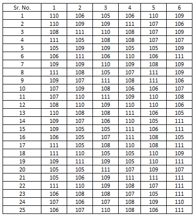
So, as per above sequentially listed steps copy the data point into excel sheet and calculate mean and range of each subgroup as per mention below image. Copy the quality data points in excel as per subgroup size as per attached in image.

The formula for process mean and range are taken as per mention in sequential steps. After calculating subgroup size wise mean and range, calculate the average of mean and range as per shown at the right side corner.
Now, we require to calculate upper control limit, lower control limit and center line as per above mention formulas for mean and range chart individually and arrange the control limits in excel sheet as per below image.

As per shown in above image, each subgroup size have same upper & lower control limits as well as center line because its calculated based on allover subgroup data points I Just calculated upper and lower control limits & center line separately and copy-paste the limits value and arrange as per above tabular image.
Now, calculation and data arrangement part is almost done of X Bar and R Chart. We only focus on to plot graph with the help of tabular data that we prepared earlier step.
First, we just try to understand what is the final outcomes of this case study? So, X Bar and R Chart calculations provide the outcome of two charts. One is mean chart & another is range chart.
For mean chart preparation select the mean line of each subgroups and parallelly select the mean chart UCL, CL & LCL table of each subgroups. After selecting four different lines go to the recommend chart and select the line chart option. Same process follow for the range chart preparation but only change is that select range line rather than mean line of selection criteria.
Review below attached outcomes after clicking ok of chart button.

Above mention charts are without formatting nature. Update the chart & manually change the chart title, change the name of series, add the axis name & add the data labels as per requirements. After the data labeling chart is look like as per below.

Conclusion of Case Study – 1: –
As per analyze the mean and range chart, both chart quality data points are either crossing the upper or lower control limits so, statistically process is not within the control right. A Pen manufacturing organization mainly focused to improve process or product quality with the changing operator skill, upgrade machinery or optimize processes that able to produce good quality products.
Look at the both chart quality data points are constantly varies from center line and many times try to cross the upper & lower control limits in mean chart. If you look at the range chart, quality data points are almost nearest to center line. Only one sub-group size cross the lower control limit. So, maintain the strong statistical process focused on to quality data points varies nearest to center line without crossing the upper and lower control limits.
For practicing similar case study by yourself review the data generation website and practice X bar and R chart.
Case Study – 2 – X Bar and R Chart: –
An extension of case study – 1 organization focused on to implement the statistical process control techniques into operational process and achieve the great results with the help of X Bar and R Chart. Now organization want to still modify the X Bar and R Chart to improve further quality in the operational process. Basically, organization want to add more two control limits that help for indicate the status of process. If the process cross the intermediate limit that set between the center line & Upper or lower control limits so, immediately process owner or operator take appropriate action before the process cross upper or lower control limits. So, modify the X Bar and R Chart as per organization expectations.
Solution: –
For modify the X Bar and R Chart we add the two different control limits between the center line to upper or lower control limits are mention below.
- Upper Warning Limit.
- Lower Warning Limit.
Before, going towards the solution just look at the formula for calculate upper & lower warning limit of X Bar and R Chart.

As per the upper and lower warning limit calculation follow the above mention formulas & same calculations done as per the upper and lower control limit in the case study -1. Review the below attached image for addition of upper & lower warning limit calculations.

Now, after the calculation done select the mean chart table and mean line & insert the chart same as case study – 1. The updated chart is look as per the below.

Conclusion of Case Study – 2: –
In concluding part of case study – 2, we added upper warning limit and lower warning limit in mean and range chart so, performer easily able to take earlier decision stop or correct the overall process. In mean and range chart we calculate the upper & lower control limits as well as upper and lower warning limit but in few cases customer tolerance limits place in the mean and range chart that is known as upper and lower specification limit. The upper & lower specification limits may be varies as per the upper & lower control limits because the upper & lower specifications limit provide by the customers and upper & lower control limits are calculated based on collection of various data.
In above mention chart many points are crossing between upper and lower control limits that means process is out of control nature. So, performer correct the process otherwise defective products produces certain period of time.
Frequently asked question about the X Bar and R Chart.
How to Analyze X Bar and R Chart?
For X Bar and R Chart analysis, just observe the quality data points and check its crossing the upper or lower control limits or not. If quality data points are crossing the upper or lower control limits that indicate, particular sample is out of control situations means out of tolerance limit in that case machine or process operator instant focused on to process or equipment & take appropriate action to control the quality.
What are the criteria for using Mean and Range chart?
1. Sample Size – 2 to 9
2. Data in Variable Nature.
How to collect data in X bar and R chart?
In the various operations as per the industries sector type there are various machines or processes to produce goods and mean time various operators operating the equipment’s or processes. Sometimes few industries are running 24 hours a day and few industries only running in days so, in short in data collection system try to covered entire system in all the conditions for checking or verifying process variations.
Collect the samples includes all the shift data, different machines involve with operator, random time variations data collection, Shift starting and ending time sample collection etc.


