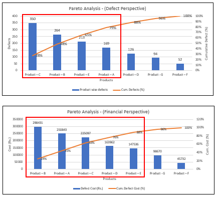
Histogram is a one of the statistical 7 QC tools to analyze quality & other data set into graphically representation. Histogram graphically represent the data set into two axis. On the most cases X-axis graphically represent the timeline and y-axis represent the group wise frequency count of data set and it may depend on data set and varies according to user applications. Histogram is also able to analyze with Microsoft excel as well as Minitab software.
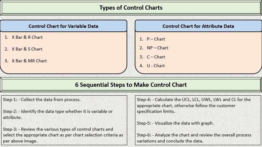
Now a day’s in many organization use statistical quality control techniques to analyze the product quality. Histogram, Pareto chart and Control charts are very popular 7 QC tools in quality control and quality assurance to analyze data spread.
Histogram Invented By: – Kerl Pearson.
Types of Histogram – Data Spread
Histogram data spread are majority divided into four pattern as per mention below. Product quality or other data are varying with the time period and with the effect of data variations group of histogram data set spread are also varies with time period. According to data variations patter varies and each data spread pattern help us to understand the process variations and very helpful to identifying root causes of the quality problems. So, now we understand data spread pattern one by one.
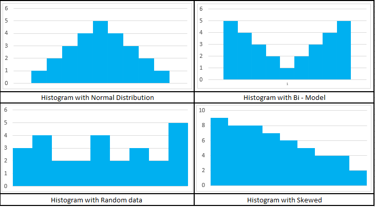
1. Normal Distribution Data Spread: –
If the histogram data set spread represents the bell-shaped curve, that called data represent the normal distribution. It means process are within control or minor variations found in the process if bell shape curve properly not maintained. If your process is perfect, normal distribution data spread represent the higher frequency nearest mean side & lower frequency of data set near lower control limit & upper control limit side.
2. Bi – Model Distribution Data Spread: –
Bi-Model type data spread are generally shown in above chart to combined measure of two process parallelly. If two process are not parallelly running then within single process two different person or operator run the machine or produce products. Bi-Model type histogram data spread process are not the idle process, there is too much variations within the process. In short process run at the border line and more chances to produce defective products. Focused on to review process & convert your data spread nearest process mean like normal distribution to produce good quality products.
3. Random Data Spread: –
Random data types are generally observed on chart based on data measurement errors, random errors in materials and errors in machines. non-normal data types are also similar to random data types. In the majority cases of random data types measurement error can be identified rather than equipment errors.
4. Skewed Distribution Data Spread: –
On skewed distribution represents the data gradually increasing in nature or gradually decreasing in nature. For example, CNC machine performs turning on a 50-diameter rod and operator continuously checking its dimension after machining the rod. Then he continuously plots all the quality data points on histogram and he observed data distributed in continuously downside then he suddenly stops the CNC machine & check quality of cutting tool & then he found wear & tear on cutting tool edge. So ultimately on the turning operation after few quantities production operator require to replace the turning tool on CNC machine.
So, Now we got the clear ideas about the types of data spread right. Now, we try to understand sequential steps to make histogram chart using excel sheet.
Sequential Steps to Make Histogram Chart Using Excel Sheet: –
Step – 1: – Copy the collected data set into excel sheet. (In data collection includes products dimensions, process parameters, students marks and other data type of data to analyze with histogram)
Step – 2: – Identify the maximum and minimum value of sample or population data set using excel formulas.
Step – 3: – Decide the interval based on maximum and minimum value of sample or population data set as well as also assume the group size for all over sample or population data to be distribute on histogram. Review below attached formula for calculating interval using excel sheet.
Interval = [ (Maximum value – Minimum value) / (Group Size – 1) ]
Step – 4: – Developed the data range based on number of groups. Initially enter the minimum value then addition of interval value simultaneously until not reaching maximum value. So, if you count the total data that perfectly match with the group size. If you increase group size more than your data spread in chart more precisely to up to certain value.
Now, you have two different data set right. One is your population data that you collected by measuring or other way and another is the group data you developed to following step – 4 right. So, let’s jump to data spread into chart using excel sheet.
Step – 5: – Go to Data bar in excel sheet and click on data analysis tool. (Data analysis tool if not visible then go to excel option and install data analysis tool within few seconds.)
Step – 6: – After the click on data analysis tool, choose the histogram option and click ok. One box is open after clicking ok, then select population data into data range and select group data in bin range box.
Step – 7: – Tick mark on data labeling, click the new worksheet and tick mark on chart output and click ok button. After clicking ok, histogram chart is automatically generated.
Step – 8: – The last step of making histogram is formatting the chart such as data labeling, maximize or minimize the width of chart, editing chart and axis title etc.
Case Study – Histogram Chart
A manufacturing organization collected some 100 quality data points for analyze the product quality statistically. They wish to plot the quality data points into histogram and analyze the trend of data points. Review the quality data points as per mention below.

As per discussion in sequential points, copy the data into excel sheet. Above mention data points are the population data. For interval calculation we need to assume out of total population data, how many groups will be divided. For examples I want to divide population data into 11 groups so interval formula will be as per below.
Interval = [ (Maximum value – Minimum value) / (Group Size – 1) ]
Interval = [ (97.4 – 9.4) / (11 – 1) ] = 8.8
So, 8.8 is the interval of 11 groups data right. So, Now, with the help of Excel sheet calculate the bin range. Initially you enter the minimum value & gradually addition the interval into the minimum value for bin range identified. Review below attached excel image for your reference.

So, as of discussed earlier, your bin range is divided into 11 groups.
Now, you go to data analysis tool in data bar & select the histogram chart in excel sheet as per mention below image.
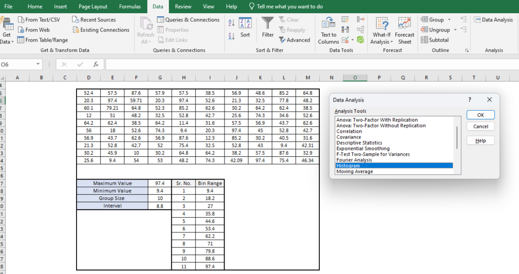
So, as per review in above image in data bar, data analysis shown in right corner of image. Now, whenever you click on data analysis one box is open. Just click on histogram and press ok button and below mention input data box open.
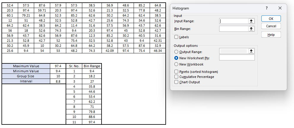
In input range select the population data, in bin range select the bin range data and click on labels. If you want histogram chart within current sheet then provide the cell location in output range, otherwise mention new worksheet tick mark as it is. Then tick mark on chart output.
Notes for selecting Input & Bin Range: –
When every you select input range and bin range data to selected with title. Your bin range groups data have already with title but population data have not. So, convert your population data in one column with any title & select the range in box.
whenever you press ok button below mention chart is automatically generated.
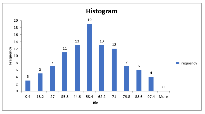
As per above chart mention horizontal axis represent the groups size or bin range and vertical axis represent the frequency of population data. this chart is shown bar type chart if you formatting the bar width and convert gap zero between two bars its look like a perfect histogram chart.

Conclusion of Case Study
As per above mention chart follow the perfect bell shaped curve or follow the normal distribution. Check out the organizational upper & lower control limit of this product and match with the chart data points, is there any variations found? if not then your process is statistically well control nature, otherwise you require to improve process. For practicing histogram chart yourself use random data generation site to generate data.
Frequently asked questions about histogram.
What are the Histogram data spread types?
Histogram data spread are mainly divided into 4 different types as per below.
1. Normal Distribution Data Spread
2. Bi – Model Distribution Data Spread
3. Random Data Spread
4. Skewed Distribution Data Spread
What are the application of histogram?
Histogram chart is currently use in to analyze & representation of continuous or discrete data set. It applicable in all the manufacturing, services and other sectors where data is generated and want to analyze data spread statistically.
What is the usage of histogram?
Usage of histogram to know the flow of data set with mean, upper control limit and lower control limit. In Chart your data set is visible in normally distributed then your system is almost perfect but any variations found from mean then you required to correct the system based on data set. In short chart provide the graphically representation of data set in to know the spread of data as per customer or organization limit range.

