To effective data measurement and analysis 7 QC tools very important for maintaining quality management system or the other managerial data. Now a day’s every business professional priority to focused on quality maintainability on products & services. If we analyze small and medium scale organizations they continuously focused to improving production but meanwhile they not able to control quality. To maintain reliability on products and services, quality is only way to enhance confidence. Effective quality management system helpful to improve & maintain products and services quality in next level. A part for quality management system 7 QC tools are really helpful to analyze quality data in an effective way and also helpful to decision making.
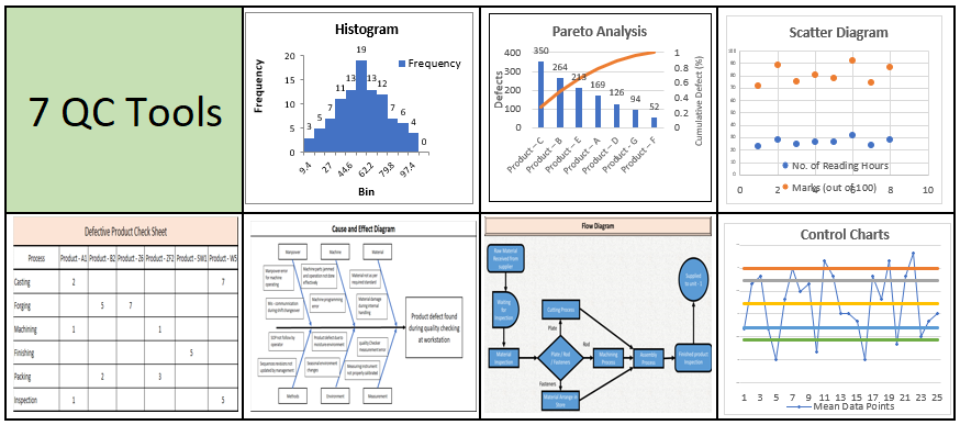
What are the types of 7 QC Tools ?
- Histogram.
- Pareto Analysis.
- Scatter Diagram.
- Control Charts.
- Cause and effect diagram.
- Check Sheet.
- Flow Diagram.
Sequential steps for 7 QC tools usage.
There are few requirements for 7 QC usage as per mention below.
- Understand the requirements: – You decide the end objective or requirements that you want to achieve with the usage of 7 QC tools. Try to understand each quality tools have different characteristics, you have to decide what is your requirement and which tool want to use. Will try to understand each tools characteristic in detail as per below.
- Data Collection: – According to the selection of the tool appropriate data collection will require and it varies with the tools. If quality control departments already collected data then use it.
- Usage of tools: – Use the specific tool as per standard practice as per mention below of each tool.
- Conclusion: – Conclude the end result after data analysis.
Practical application of 7 QC tools.
- Histogram: – Histogram is used to analyze the distribute of various data and identified it is normally distributed or follow the pattern of other distributions.
- Pareto Chart: – Pareto chart is helpful to analyze the various category of defects and suggest which defects are analyze on the priority to minimize the defect rate.
- Scatter Diagram: – The main purpose of scatter diagram is to analyze the two variables on the same graph. Scatter diagram also helpful for visually analyze the pattern of variables and how it is deviated from the trend line.
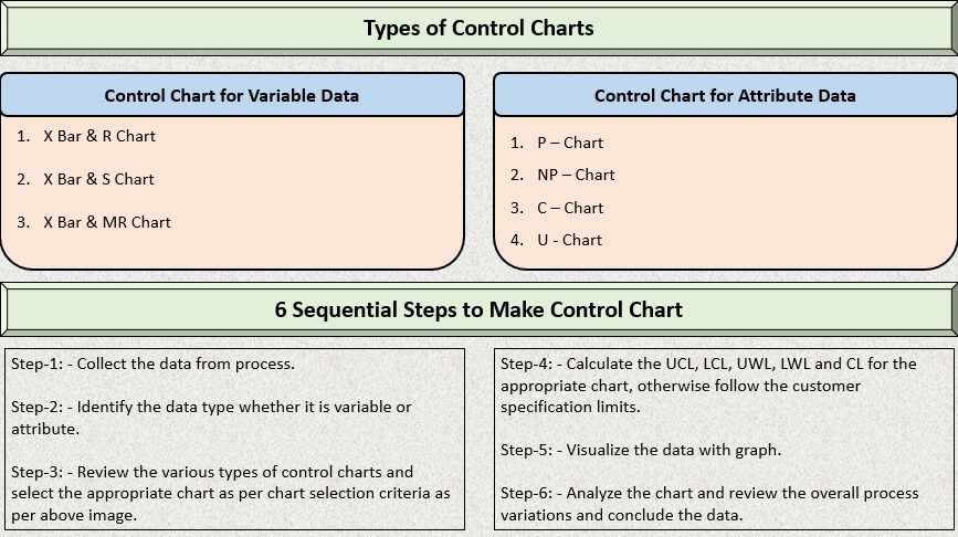
- Control Charts: – Control chart is useful to monitor the process within control or not. It can be used to monitor continuous process as well as end of the processes. Control limit has been decided with respect to organization and customer perspective.
- Cause and effect diagram: – Cause and effect diagram analyze the root cause of various problems. In cause and effect diagram problem can be analyze in the 6 category such as manpower, material, machines, methods, measurement and environment.
- Check Sheet: – Check sheet is mainly used to collect various data, counting the various items with different category, list down the various defect causes for validations or similar issues.
- Flow Diagram: – Flow diagram represent the sequential path of various process for easily analyze & review operational process for identify bottleneck, review product flow, information flow and many more.
Scatter Diagram of 7 QC Tools.
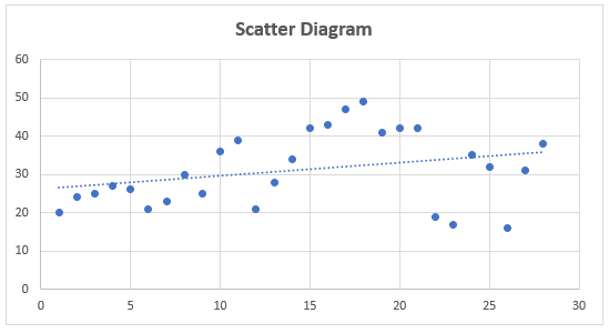
Scatter diagram is one of the easiest 7 QC tools and help to graphically analyze relationship between two parameters or variables. Basically, scatter diagram parameters representation on x and y axis of graph. Representation parameters are depending on user requirement. Scatter diagram is easiest way to compare one parameter performance over a period of time or other parameters against another parameter performance. Scatter diagram is also accurate for single parameters performance analysis. If we analyze and compare two or more parameters performance on scatter diagram, then several logics developed between two or more variables as per mention below.
- One parameter directly dependent on another parameters.
- One parameter indirectly dependent on another parameters.
- There is no dependence on each other.
If we practically trying to understand the performance of two parameters on scatter diagram then you will have more clarity on parameters relativeness. If we compare two parameters such as GDP and top 50 organization index funds and plotted past years data trend on scatter diagram then we strongly realize one parameter is directly dependent on other parameters based on visually graph pattern checking.
For mapping scatter diagram graphically, Microsoft excel as well as Minitab software very much useful and both software are user friendly designed. Review the below attached sample scatter diagram for your better understanding.
Sequential steps for making scatter diagram using excel sheet.
Step – 1: – Copy the data sheet into Microsoft excel.
Step – 2: – Select the data and go to insert tab in chart section & select the appropriate scatter diagram.
Step – 3: – Modify the chart as per individual requirement such as title addition, background changes, addition of axis name, enable data labeling etc.
Flow Diagram of 7 QC Tools.
Flow diagram is also called as flow chart and it helps to graphically represent the overall process to easily understand step wise starting point, ending point and intermediate work flow of various processes. Many organizational professionals mostly used the flow diagram to represent various process to various clients those are unknown with the process and they quickly get the basic idea of process. Flow diagram is part of 7 QC tools to represent the flow of any activity whether it is data, process, event or information.
What are the three types of flow diagram used in operation management.
- Process Flow Diagram
- Data Flow Diagram
- Work Flow Diagram
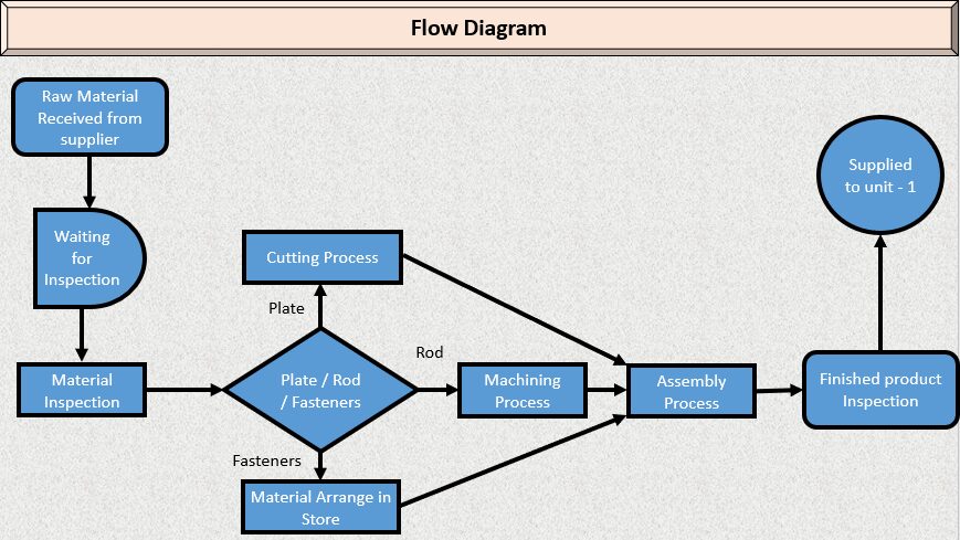
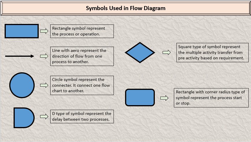
As per shown in above flow diagram is developed for general manufacturing process. There are certain rules to construct a flow diagram and each and every symbols represent the specific information. Review what are the symbols used to construct a flow diagram as per below.
Cause and Effect Diagram of 7 QC Tools.
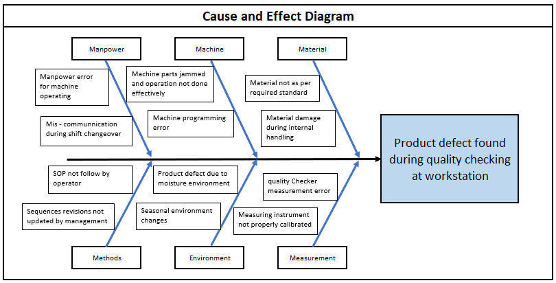
Cause and effect diagram mainly focused on to resolve various problems and identified causes and its effect and help to resolve the problem with root cause. Cause and effect diagram are the part of 7 QC tools and help to resolve quality, operational and ground level problems. It is also called as fishbone diagram because when we analyze the problem with cause and effect diagram all the structure look like fish. Mainly construction of cause and effect diagram is designed into six standard category such as manpower, machine, material, environment, methods and measurement. Each category analyzes the problem with root cause and identify solutions.
According to the type of problems, six standard category you can change as per your requirements. Sometimes your problems can be solved with the two to three categories. Each category asks few questions for deriving various causes and its effects such questions are start with 4 W’s – Where, When, Who and What.
Check Sheet of 7 QC Tools
Check sheet is a very effective 7 QC tools to collect various process data. Check sheet is also useful to collect variable as well as attribute data such as process performance, product defects, Product acceptance, inventory levels and many more. There are various types of check sheet that many professionals are using according to its application such as Data collection, frequency counting, conformance check sheet and many more. Review sample check sheet for your better understanding.


